Stats fans can actually feel.
BBL Data Visualization Concept
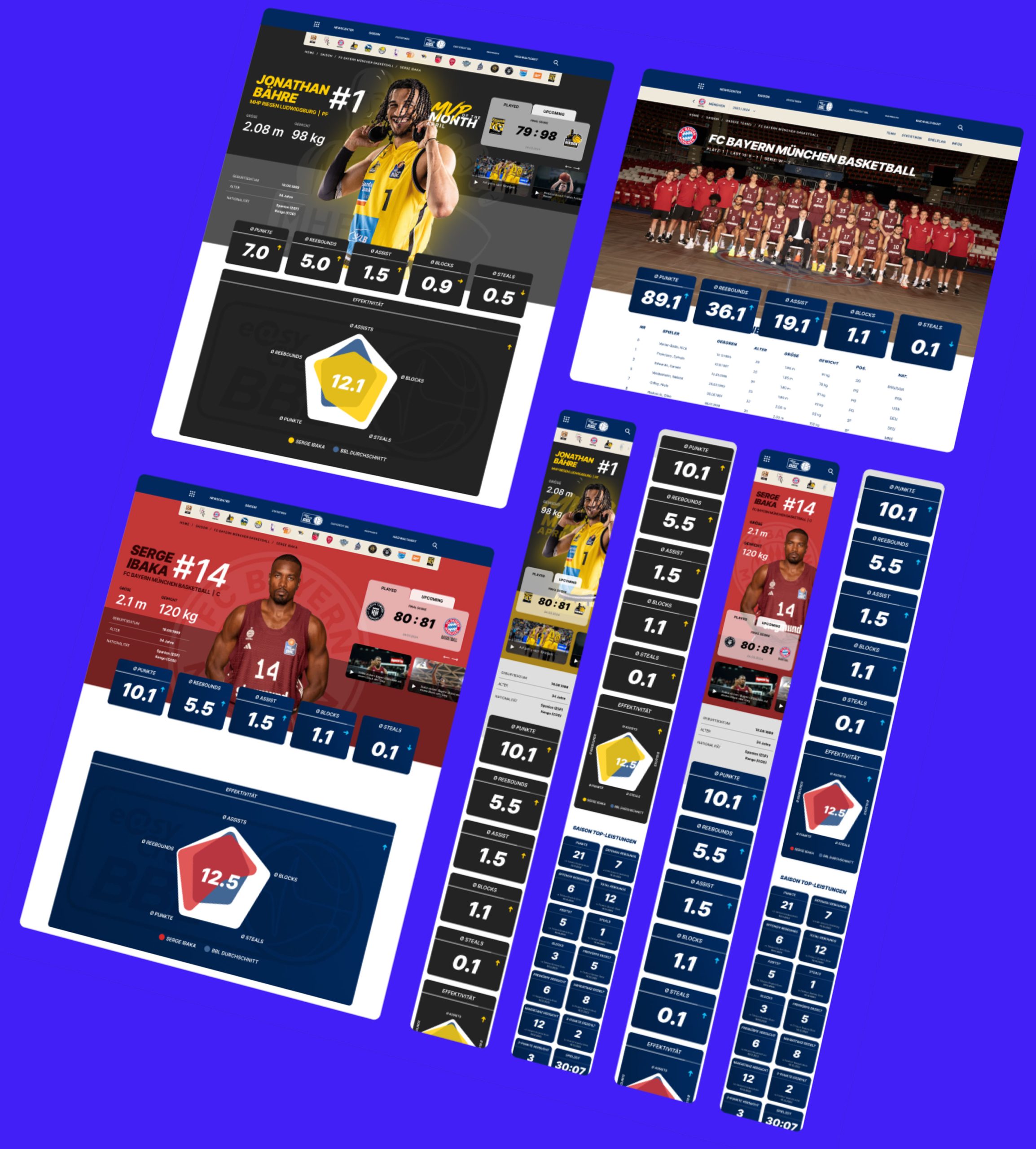
Get in the Game:
Explore BBL Stats Like Never Before.
StBasketball runs on numbers. Every fan already lives inside them, points per game, shooting percentages, season rankings, but most of that data still lives behind spreadsheet-style tables that only the die-hards bother to read.
The challenge
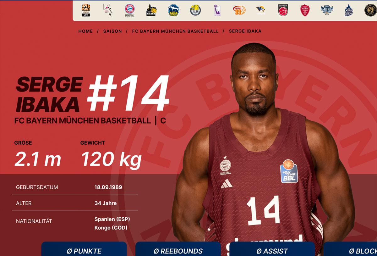
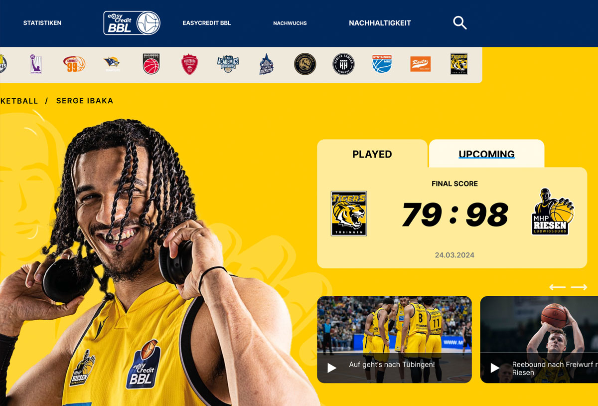
The BBL wanted a way to bring its stats closer to fans, not just present them. The brief was to design a concept that made game stats, player performance and team rankings genuinely engaging, for the casual viewer scrolling on a Tuesday night and the stat enthusiast tracking every possession alike.
The approach
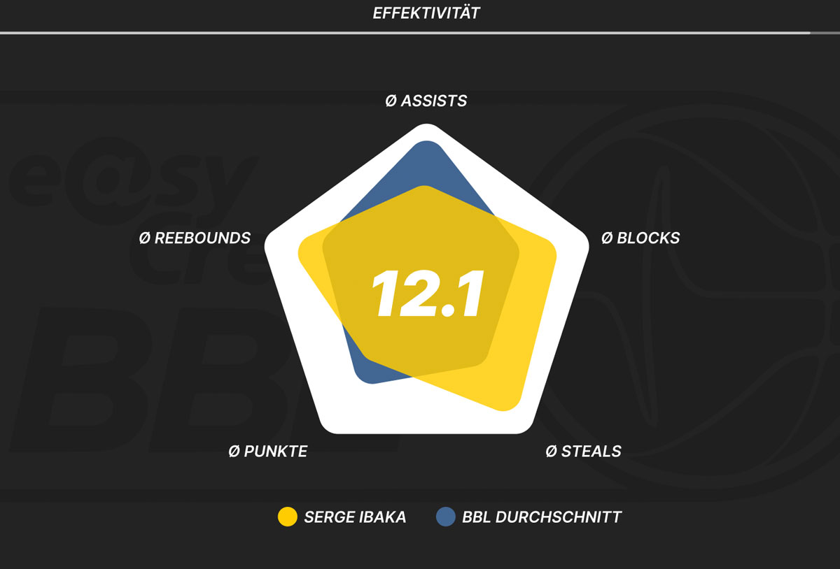
We designed an interactive data visualization concept built around one idea: complex data should be easy to explore, not just easy to find. An intuitive layout let fans move naturally between real-time stats, player comparisons and season progress, while dynamic visuals turned raw numbers into something worth looking at rather than scanning past.
Every screen was built to answer a simple test. Would a fan stop scrolling for this?
The outcome
A concept that reimagined how the BBL's data could feel: accessible enough for a casual fan, deep enough for a stat nerd, and visually strong enough to make numbers the reason people stay on the page. The pitch wasn't taken further at the time, but the concept remains one of my favorite explorations of how far sports data visualization can go when engagement, not just accuracy, is the design goal.